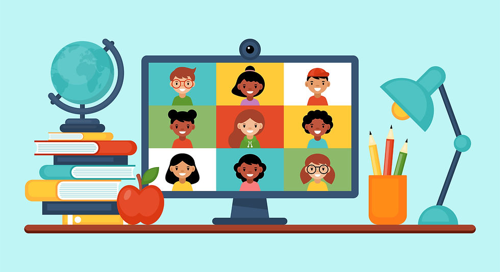
Five Ways the Pandemic Changed Online Learning Forever
- HiLink

- Jun 2, 2022
- 3 min read
In March of 2020, the pandemic arrived and changed everything. Schools, where hundreds of teachers and students gathered, began to close and move to online learning. Students, teachers, and parents all had to adapt to what was virtually unknown territory. The pandemic revealed both the potential and the pitfalls of online learning. Let’s look at the top five ways that the pandemic changed online learning.
1. Online learning went from supplemental to essential
Before the pandemic, very few schools offered online learning. Online study was relegated to a class or two, or for limited purposes. During the pandemic, online learning became the default that helped more educators and students stay safe while continuing to study and participate in the school experience from home. The result of this shift is that a demand has been created for learning that can be done anywhere, at any pace, during any time.
2. Online learning left many parents and students in a new learning paradigm
Even the most tech-phobic teachers and parents were greeted with the challenges of integrating technology into their lives. Learning Management Software or LMS became prominent both for standard education, as well as being used to address learning gaps that occurred during the height of pandemic. Online Learning tech is here to stay even as students go back to the classroom. The technology must be easy to adapt to, for busy learners and teachers. It must also integrate into the learning experience from here forward to enhance classroom learning or replace it for those who may need an alternative learning option.
3. The shift to online or hybrid learning showcased a need for ongoing training for educators
One survey that was conducted by Bay View Analytics found that very few teachers had prior experience teaching remotely. This finding highlights the need for remote learning tools that are easy to learn, navigate and that have integrative functionality for a seamless classroom experience.
4. Institutions were forced to look at how accessible their course offerings were
Some schools were forced to reckon with the limited availability of course offerings in their catalogue, while other schools became aware of how accessible their current curriculums were. The pandemic shined the light on accessibility options and helped schools to realize they would need to offer more courses that were available to students of varying abilities.
5. The pandemic forced education to make technology upgrades that were long overdue
In higher education, tuition costs have been rising. However, many universities were falling behind in their course offerings and overall value because they were already operating with outdated technology. Even though remote learning became the standard in 2020, many universities were employing technologies like Zoom, without factoring in all the classroom essentials that would need to be modernized.
Online learning has changed forever because of the pandemic. Schools and Universities will be looking to modernize and make the online learning experience better for teachers and students. Inequalities in education will need to be addressed, as well as how accessible the material is for the variety of needs of students. Educators have accepted that online learning is here to stay as part of their teaching experience. Technology must be easy for them to use and help them manage their classrooms.
With a virtual classroom, learning management system, and administrative tools integrated, HiLink builds a learning ecosystem that helps the learning environments modernize and move forward in the post-pandemic world. To find out how HiLink can improve your educational environment, contact one of our specialists for a free demo today.


hubet com mình lướt thử vì thấy nhiều người nhắc, chủ yếu tò mò giao diện họ làm kiểu gì thôi. Vào trang cái là thấy menu đặt khá dễ nhìn, bấm qua lại mấy mục không phải tìm lâu. Mình thích kiểu họ chia nội dung theo từng khối riêng, nhìn một phát là biết đang ở phần nào, không bị dồn chữ hay rối mắt. Màu sắc cũng vừa phải, không quá chói nên ngồi xem một lúc vẫn ổn. Nói chung mình không đào sâu gì, chỉ xem cách họ sắp xếp thông tin cho người mới vào. Điểm mình để ý nhất là các nhóm nội dung được tách rõ ràng và menu điều hướng nằm…
bongdalu mình thấy dạo này nhiều người nhắc nên cũng tò mò bấm vào xem thử giao diện thế nào. Mình không kiểu ngồi soi từng thống kê đâu, chỉ lướt nhanh để xem họ sắp xếp thông tin có dễ nhìn không. Ấn tượng đầu là trang chia theo giải khá rõ ràng, nhìn một cái là biết mình đang ở mục nào chứ không bị lẫn lộn. Mấy bảng hiển thị gọn, chữ số và hàng cột thẳng thớm nên kéo xuống xem cũng nhẹ mắt. Mình thích kiểu menu để ngay chỗ dễ thấy, chuyển qua lại giữa các phần không phải tìm nhiều. Nói chung dùng vài phút là quen tay, vì bố cục dạng bảng…
https://b52.black/ mấy hôm nay mình thấy mọi người nhắc hoài nên tò mò bấm vào thử cho biết. Mình không có thời gian ngồi xem kỹ từng nội dung đâu, chủ yếu lướt qua xem trang họ làm có dễ nhìn không. Ấn tượng đầu là bố cục khá gọn, nhìn phát biết chỗ nào là khu chính chỗ nào là phần thông tin phụ, nên không bị rối mắt. Cái mình thích là thanh menu để khá rõ ràng, chuyển qua lại giữa các mục nhanh, không phải mò lâu. Mà màu sắc với cách canh chữ cũng ổn, đọc không bị mỏi. Nói chung chỉ lướt vài phút thôi mà mình đã nắm được cách họ sắp xếp…
https://trangcadobongda.bio/ mình thấy mấy hôm nay nhiều người nhắc nên tò mò bấm vào xem thử cho biết. Mình không có thời gian đọc kỹ từng bài hay soi kèo gì đâu, chủ yếu xem cách họ làm giao diện có dễ nhìn không. Vào trang cái là thấy menu để khá lộ, nên muốn chuyển mục nào cũng không phải tìm lâu. Mình thích kiểu họ chia thông tin thành từng khối riêng, nhìn lướt qua là biết chỗ nào là bảng dữ liệu, chỗ nào là phần tin. Nói chung cảm giác gọn gàng, không bị nhồi chữ quá nhiều nên đỡ mệt mắt. Mình chỉ mong mấy trang kiểu này giữ được cách sắp xếp rõ ràng…
iwinclub dạo này thấy nhắc nhiều quá nên mình cũng tò mò bấm vào coi thử. Vừa vào cái là thấy giao diện nhìn khá thoáng, nền sáng nên mắt đỡ mệt, không kiểu nhồi chữ dày đặc. Mình lướt sơ thôi chứ không ngồi xem kỹ nội dung, nhưng cách họ chia từng phần theo khối nhìn dễ hiểu, kéo xuống một chút là nắm được trang đang có gì. Cái mình thấy tiện là tiêu đề mỗi khối để rõ ràng, nên đang tìm thông tin gì thì liếc cái là biết chỗ nào để bấm, không phải mò lâu. Nói chung cảm giác dùng giống mấy trang giải trí bình thường, thao tác đơn giản. Nhìn tổng…